Sunday, September 2, 2012

Fine Tuning Your Objects - Dimension & Expression Attributes


Most of the time, clients simply care about getting their data.   And it is sometimes no small effort to transform business requirements (or lack thereof) into a working QlikView application.  Sometimes there is no room left in the budget for the finer design points. 

But many times, I find that going that extra mile to bring simple and intuitive meaning to the data can make the difference between QlikView being perceived as a lackluster business tool and the “lean forward experience” that we all want it to be (to use the words of Donald Farmer). 

Maybe we should highlight the new product line in our bar chart, or maybe we want to see the best and worst performers in a table or I want my forecast as a dotted line and my average trend to be a thinner line.

Now this kind of highlighting is not always intuitive in QlikView.  It took me a while to realize the power of these settings and I am still not at the point where I have memorized all the small syntax pieces needed to add these touches.  So I thought I would put together a small article to illustrate some examples and also to give myself and others an easy place to reference these codes.

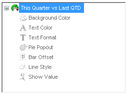
The items we will cover are accessible in the dimensions and expressions tabs of your object properties.  If you expand the plus sign in your used dimensions or expressions, you will find the attributes we are discussing.  All these settings will require some form of calculated expression to work.  Also note that these settings will override any other display settings you have in the object.  We will examine these attributes in order.


Dimension Attributes
Dimension attributes only work in straight or pivot tables and will affect dimension columns.

Background Color and Text Color
These two attributes work the same way with one affecting the cell background and the other affecting the font color.  In this case, we want to highlight our new product line:

Background Color:
=IF(Product='Bazinga',RGB(100,100,100))

Text Color:
=IF(Product='Bazinga',White()) 


Text Format
The Marketing Director likes that but wants to go  a step further by displaying the text in bold italics.  No problem:

Text Format:
=IF(Product='Bazinga','<I><B>')


Note that you can use the following text formats and also that you can use more than one at a time like in our above example.
=’<B>’
Bold
=’<I>’
Italics
=’<U>’
Underline


Expression Attributes
Expression attributes are available in some capacities for all chart types.  These attributes affect the expression columns of a chart.

Background Color, Text Color and Text Format
Just like in the dimension attributes, Background and Text color change the colors of values in the data.  Text color only has an effect on straight or pivot tables.  Background color is adjustable for tables, and several other charts.  First, let’s adjust our straight table example again.  This time we want to highlight the cells that represent the best and worst performers in their expression columns.  We will also adjust the text format:

Background Color:
=IF(RANK(SUM({<IsForecast={0}>}Qty))=1,LightGreen(),
               
IF(RANK(-SUM({<IsForecast={0}>}Qty))=1,Red()))

Text Color:
=IF(RANK(-SUM({<IsForecast={0}>}Qty))=1,White())

Text Format:
=IF(RANK(SUM({<IsForecast={0}>}Qty))=1,'<B>')


Now let’s look at a bar chart.  We will go back to our previous example of highlighting the value that is our featured product type.  This is done with the Background Color attribute:


Background Color:
=IF(Product='Bazinga',RGB(0,255,0))


Pie Popout
The Pie Popout attribute is obviously only available when using a pie chart.  This will advance one slice of the pie slightly out from the center.  Let’s highlight our chosen product line.

Pie Popout:
Product='Bazinga'


Bar Offset
This attribute, when used in a bar chart, will raise a bar off the x-axis by a calculated amount.  This could be useful to create gaant charts.  For lack of a better example, we will stack each year’s sales on top of the previous total.

I first created an invisible expression called RunningTtl:
IF(RowNo()=1,SUM(Sales),
               
ABOVE(RunningTtl)+SUM(Sales))
Then I created this expression in the Bar Offset attribute:
IF(RowNo()=1,SUM(Sales),
               
ABOVE(RunningTtl)+SUM(Sales))-SUM(Sales)


Line Style and Show Value
These attributes are for use in line charts (or combo charts with line expressions).  The Line Style attribute changes the line to dotted, for example.  Show Value will allow us to selectively choose which points have a textual representation.  As stated before, these attribute settings will override any higher level configurations.  This time, we would like the sales figures to be represented by a continuous line (default) and the forecast to be displayed as a dotted line.  We also have a request to label the current year’s sales with text.  In addition, we want an average line that is very thin compared to the sales line:

Line Style (continuous vs. dotted):
=IF(IsForecast=1,'<S3>')

Show Value:
Year=Year(Today())

Line Style (width):
='<W.5>'


Line Style – Type
Description
=’<S1>’
Continuous
=’<S2>’
Dashed
=’<S3>’
Dotted
=’<S4>’
Dotted & Dashed

Line Style – Width
Description
=’<Wn>’
n = .5 – 8 to determine width of the line.


I am sure there are many more compelling uses for these attributes.  I believe they can add tremendous value in your visualizations as long as they are used for valid reasons.  Take your applications to the next level.

Tuesday, May 1, 2012

Developing QlikView Apps for the iPad


All observations here are as of QlikView 11 SR1 (11282).


Overview

In my last article I talked about my overall impressions of QlikView on the iPad.  To review, I am excited about it as it will revolutionize the way we consume data in business.  

But the experience does have some issues that are specific to the iPad.  Most of these are very minor and can be thankfully worked around without too much effort.  The key with all of this is balance.  We want to ensure that the user performance is as optimal as possible regardless of the appliance that will be used to access QlikView.


Ratio

The first area we must focus on is screen ratio.  Now it is easy and perfectly OK to perfectly ignore this issue by building a sheet that is very long (or wide) that basically encourages the user to scroll down through the entire page like a blog for example.  I have seen examples of this and it works well on the iPad.  But if you do not take this approach, then you should strive to create the perfect ratio that encourages an automatic “snap-to-fit” on the iPad.  In my experience, that ratio is 1024:628, or my preferred overall resolution of 1320:810 (more on size later).  You might need to experiment with this template to reach the perfect balance.  You want the snap-to-fit gesture to automatically place the edges of all your objects to be in view. 

Ignore the ratio issue with this type of a layout so users assume scrolling down the page:


Respect the iPad screen ration with this style of a layout (not to scale):


Whatever you do, make your choice obvious.  If you follow the long approach, it would be wise to have an object or two that crosses the threshold of viewable vs. non-viewable space so that the user can easily observe “there is more to discover” rather than having to consciously look for a window scroll bar.


Size

Size or resolution goes hand-in-hand with ratio.  I know when I am developing for the iPad that users will actually be using their desktop/laptops as well as the iPad.  I personally find that limiting the overall resolution of an app to 1024:628 pixels makes for a very small footprint on a typical office workstation monitor.  Besides, the newest version of the iPad is double that size with a native resolution at 2048:1536.  That is actually too large for most office monitors!  So I have found my “sweet-spot” at 1320:810.  This creates a very presentable window on most monitors while also creating that “snap-to-fit” ratio we talked about on the iPad.  An added advantage of more pixels is that when a person zooms with the newer iPad, we will retain a sharper image as we move to a higher overall resolution.


The other issue concerning size, is that the iPad will naturally reduce the height of the tab row with an increase in the overall width of the application when it is fit to the screen.  This means that you need to be cognizant of the balance so that the tab row is easily navigatable or not use a tab row at all.  Either way, this will affect the “perfect ratio” slightly, so some adjustment might need to take place.


The easiest way I have found to make that adjustment is to place an almost transparent 10x10 text box in the lower right corner of your screen.  Of course, you must subtract 10 from the X and Y since the text box consumes 10 pixels both ways.  But fine adjustment of this text box and then testing on your access point with an iPad will get you to that perfect fit.  And then I just leave that text box there on each sheet so that the iPad knows what to snap to.  A user will likely never notice it.


Text in a Text Box

So once we get past the big issues of ratio and size, there are many small inconveniences that have to be worked through.  The first is the positioning of text inside a text box.  You have probably noticed on various browsers up to this point, that text placement can vary inside a text box.  If you have ever placed a text image like an icon on top of a text box with text, you have definitely seen your images “move” in that text frame. 


What is actually occurring is that different browsers treat fonts and font sizes slightly differently.  So Internet Explorer might fit 150 Arial 10pt characters into a text box while Google Chrome might fit 155 characters into the same width box.  Observe the following:

QlikView Desktop:


Google Chrome:

Internet Explorer:


iPad:


The above scenarios illustrate this is not a one-size-fits-all scenario.  The other problem with the way the iPad in particular treats text boxes is that regardless of the vertical positioning you select, text will always appear Top justified.

So my approach then is to make all my text boxes top justified.  To solve the character spacing issues, the only thing you can do is to purposely decide where line breaks will be.  This will minimize the issue, although it does away with the convenience of natural word wrapping.


Font Sizes

When navigating on an iPad, we use our big fat fingers.  Our fingers in reality are a poor substitute for the fine control of a mouse when it comes to selecting something.  That means we need to make our buttons and our selection areas larger than normal.  If a person is expected to click on something, you need to use at least an 11pt font.  For chart legends and other displayed text, you can go to 10pt or maybe 9pt.  But, keep in mind that the overall resolution of your app will enlarge or shrink the font sizes when the screen is fit to the iPad.  I would suggest that after you have settled on the overall resolution, create some list boxes of different sized fonts and try them out. 

Objects

Multiboxes – I have heard people say that multiboxes are a no-no for the iPad.  I have only gotten in-depth the experience on version 11 and I think they are fine.  The only issue is that I would not use grid style multiboxes in any application because the AJAX client renders them as the normal multibox.  This is an AJAX issue, not an iPad issue. 

Sliders – It is very frustrating using a slider on an iPad in its current form.  For the life of me, I can’t get consistent operation no matter what I do.  Unless you want users to throw their iPad across the room, don’t use them.

Horizontal Scroll Bars – I have no problem using objects with a vertical scroll bar.  Just sliding your finger up and down the left side operates it well.  And for that matter, horizontal scroll bars on straight tables and pivot charts work fine too.  But for some odd reason, if you create a horizontal scroll on visual charts like line charts or bar charts, it is difficult to engage the scroll control.  I have set my charts to continuous or not set a x-axis limit for the most part. 

Hover Help – This is kind of obvious.  There is no way to hover on a touch device.  So, all those fancy help hovers and chart value popups will not be accessible when using an iPad.  A nice way to do this for help and definitions is with an “info” button placed on top of an object or somewhere else on the sheet.  For values that normally popup, you will need to display expression as text or maybe allow fast change to a straight table.

Right Click – Another obvious problem is that there is no right-click on a touch device.  So all the fancy options you get when right clicking an object are not accessible.  The easy fix for this is to go to captions and add the “menu” icon.  This will allow a user to click on this icon and pull up all the right click options.  Of course this might not be a necessity…

Missing Functionality – You might notice many missing features in the iPad AJAX experience compared to the desktop AJAX experience.  Here is a list of what you cannot currently do on the iPad:

Right Click Object Menus:
  • Properties
  • Copy
  • Print
  • Export


AJAX Menu Options:
  • Selections
  • Repository
  • New Sheet Object
  • Select Fields

So why can I “Send to Excel” on an iPad but I cannot popup current selections?  Your guess is as good as mine.


In Summary

Luckily, there are not that many items to consider when balancing an application for multiple device use.  Just being aware of the issues will help us create more universal applications. 


The iPad and other mobile devices represent a huge potential to get QlikView into the hands of more people in more places.  So let’s encourage that movement by creating applications that work well with these new devices. 

Monday, April 16, 2012

The iPad and QlikView - A Dynamic Duo


(Warning – This will be light on the technical stuff and heavy on subjectivity for a change.  I will follow up soon with some more technical information on this topic)

There are many famous duos in American popular culture. 

Simon and Garfunkle
Axl and Slash
Batman and Robin

Like all great teams, their value is greater than the sum of their parts.  Great teams are almost inseparable (although Paul Simon had a great solo career).  Great teams complement each other.
So for the consideration of the Academy, I would like to nominate a new great duo:

The iPad and QlikView

After recently picking up the newest iPad, I was pleasantly surprised by the experience.  And I was surprised for a few reasons.  First, QlikView is beautiful on the iPad.  Secondly, it works well.  And lastly, it is FUN.

Of course, every great team has its share of problems.  Axl and Slash hate each other today.  But I will save the minor issues relating the iPad and QlikView for another post.  But I will save any of the minor issues and design workarounds relating to QlikView and the iPad  for another, more in-depth, post.

The Beauty of Mobile Data

I never liked the AJAX experience until recently.  I am so used to the full desktop client that it is hard to swallow all the flaws that become obvious in the AJAX rendering.  With the release of QlikView 11, this has become less of an issue lately. 

But I think the essence of why it translates so well into the iPad is the smaller form factor.  The screen is big enough to provide ample real estate, while small enough to some flaws in pixel-perfect placement.
And the new retina-display allows for a very sharp image.  They “sparkle” off the tablet.  The greater resolution also allows for a perfect rendering when zooming.

Elegance in Performance

It is likely cliché at this point to talk about how the iPad “just works”.  QlikView R&D must have been taking notes, because when you open a document on the iPad, it just works.  Having an interface you can touch is a natural fit for a product like QlikView.  QlikView has taken advantage of many of the inherent gestures and other methods for getting around on iOS.  The interface is intuitive and fast. 

Snapping to fit works very well, generally adjusting the resolution to the smaller of the length or width in relation to the aspect ratio.  Zoom is equally easy and intuitive.  Traditional desktop users will miss the right click and lack of hover, but good design will make up for these issues.

Having Fun with QlikView Again

It is likely a combination of the mobility of the hardware and the excellence in execution from both parties.  I am having fun using QlikView again.

I have found myself spending hours on the couch at night, analyzing my data on the iPad.  Tapping through selections and seeing the changes on various tabs of my documents is actually fun again.  It reminds of when I first started using QlikView.  And the fact is, I can do this analysis on the couch in front of the TV (although the TV is mad because I am ignoring it).  The iPad has reinvigorated my excitement for data analysis and application design.

The Future of this Great Team

The wave is coming.  Organizations are starting to see the value of this new hardware and QlikView has smartly put itself in a perfect position to reap some of those rewards.

I often see commercials for iPads and other tablets where they gush about how useful the tablet is for business.  Invariably there are screenshots of some charts and graphs on the display.  QlikView fits the bill perfectly.  It is the quintessential mobile BI app.  With this new mobility we can discuss scorecards with vendors, industry statistics with clients, and widget production data on the factory floor.  It is definitely coming to a user, client, company, enterprise near you.